Cincinnati Museum Center
Project Overview
When I was given the freedom to choose my own exhibit topic, I knew I wanted to do something that felt genuinely original. Camouflage stood out immediately — not just as a subject, but as an experience waiting to be designed. I had never seen a museum exhibit dedicated to it, and the more I thought about it, the more I realized how much creative potential was sitting there untouched. Nature's ability to conceal things in plain sight is endlessly fascinating, and I wanted to build something that let visitors feel that wonder firsthand rather than just read about it on a placard.
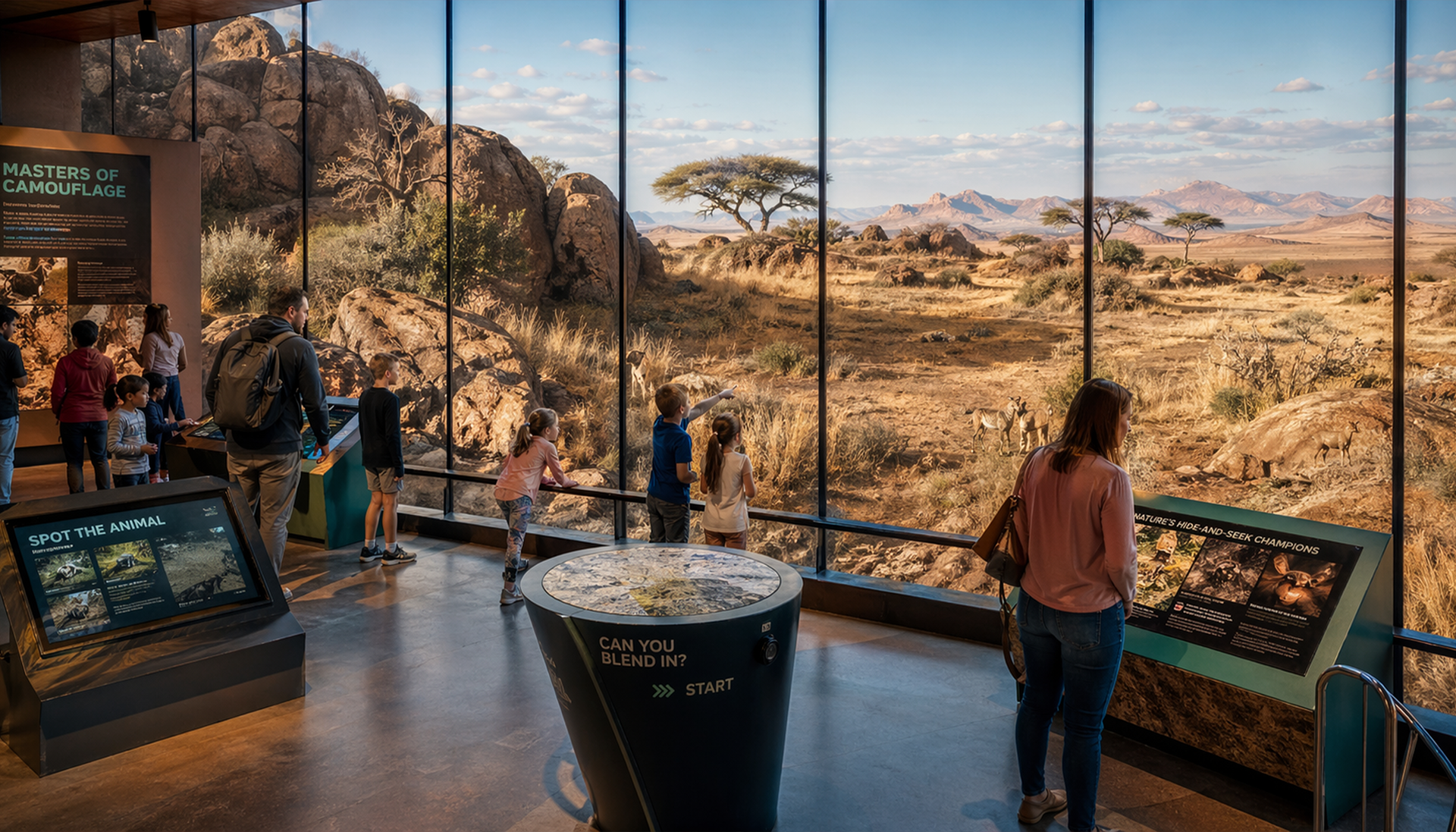
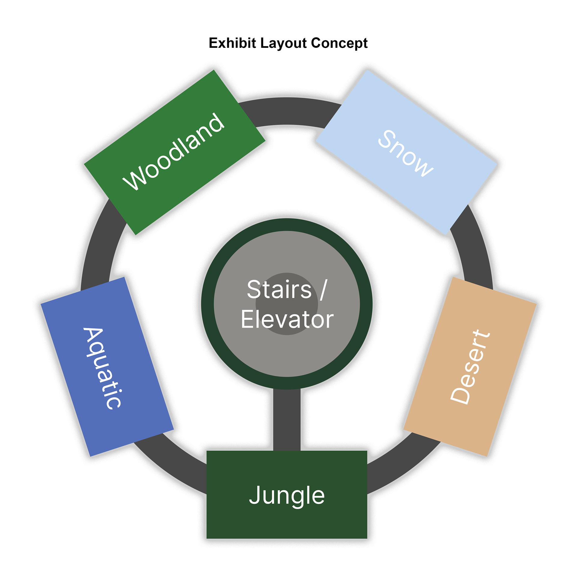
The concept I developed was a fully immersive exhibit for the Cincinnati Museum Center organized around five distinct biomes — Woodland, Snow, Aquatic, Desert, and Jungle. Each environment showcases the unique camouflage strategies of the animals that live there, with large glass displays, interactive physical elements, and seamless tunnel transitions between biomes that gradually shift from one environment to the next. At the center of it all is a glass elevator surrounded by a circular staircase, with jungle trees visible through the walls and camouflaged animals tucked throughout. The exhibit was designed to reward curiosity — the more you look, the more you find.
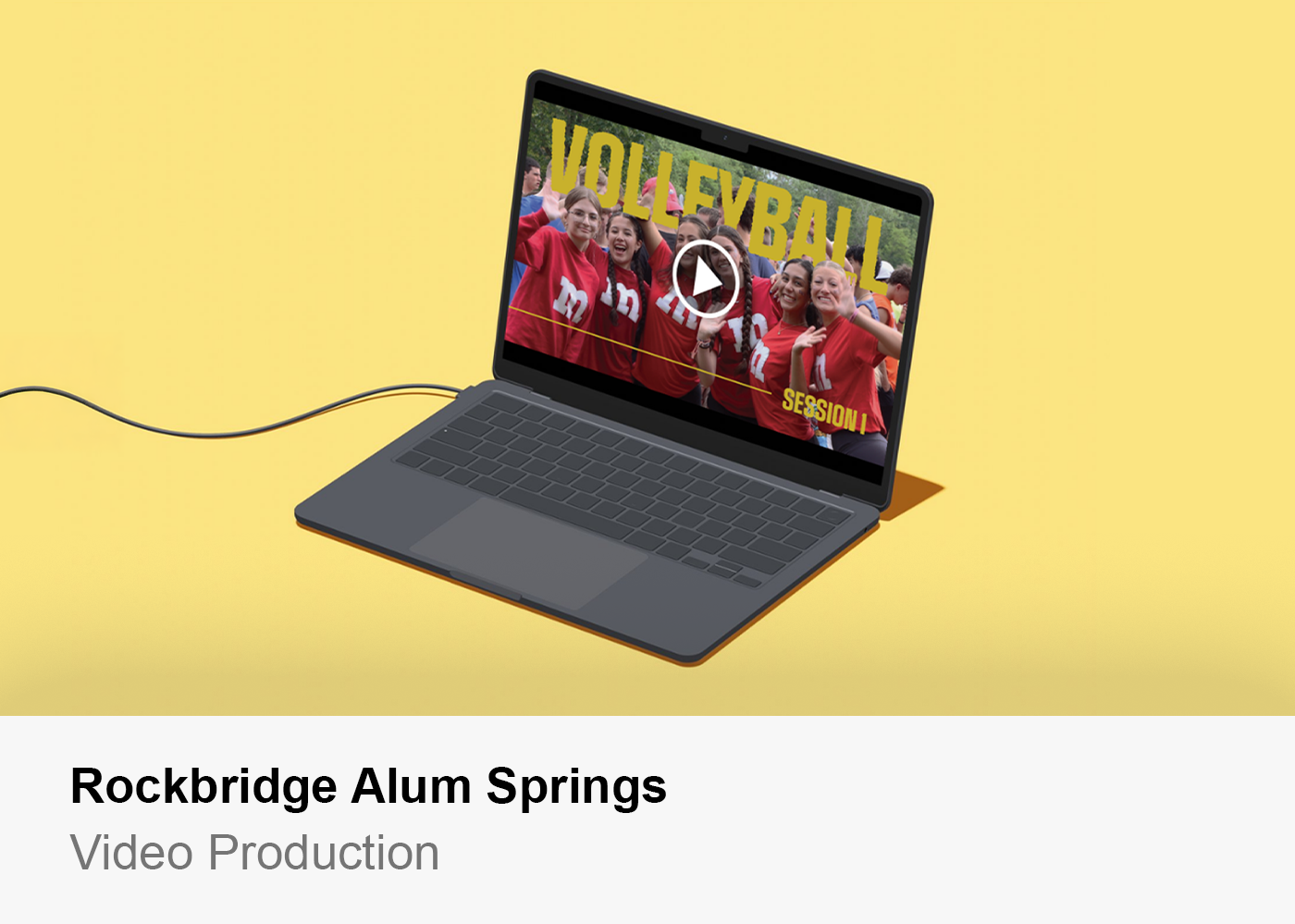
Beyond the physical space, the project included a fully designed multi-page website and an interactive mobile app, both built to extend the exhibit experience and make it feel like one connected world from the moment a visitor arrives online to the moment they walk out the door.
Moodboard & Creation Process
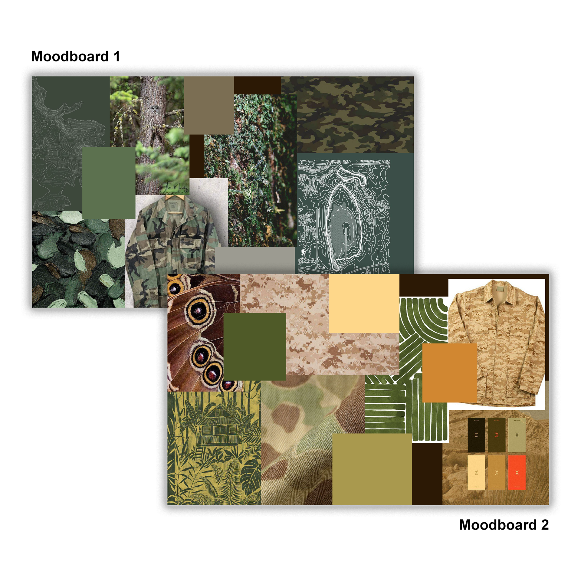
Before I opened Figma or touched a single design file, I spent time building moodboards to lock in the visual direction for the project. I created two separate boards — one pulling from deep woodland greens, mossy textures, forest photography, and natural camouflage patterns, and a second exploring warmer desert tones with sandy browns, golden yellows, burnt oranges, and military camouflage references. After sitting with both, I made the decision to go with the warmer palette from the second board. The yellow and orange tones felt more energetic and unexpected for a nature exhibit, and I thought that contrast would actually make the design more striking and memorable than defaulting to all greens.
The moodboards pulled from a range of references — butterfly wing close-ups, topographic trail maps, jungle canopy illustrations, camouflage fabric textures, and color swatches that I curated carefully to make sure the palette stayed cohesive. These boards became the foundation that everything else was built on. Every color decision, every image choice on the website, every UI element in the app traces back to the direction I set here.
Wireframes / Sketching
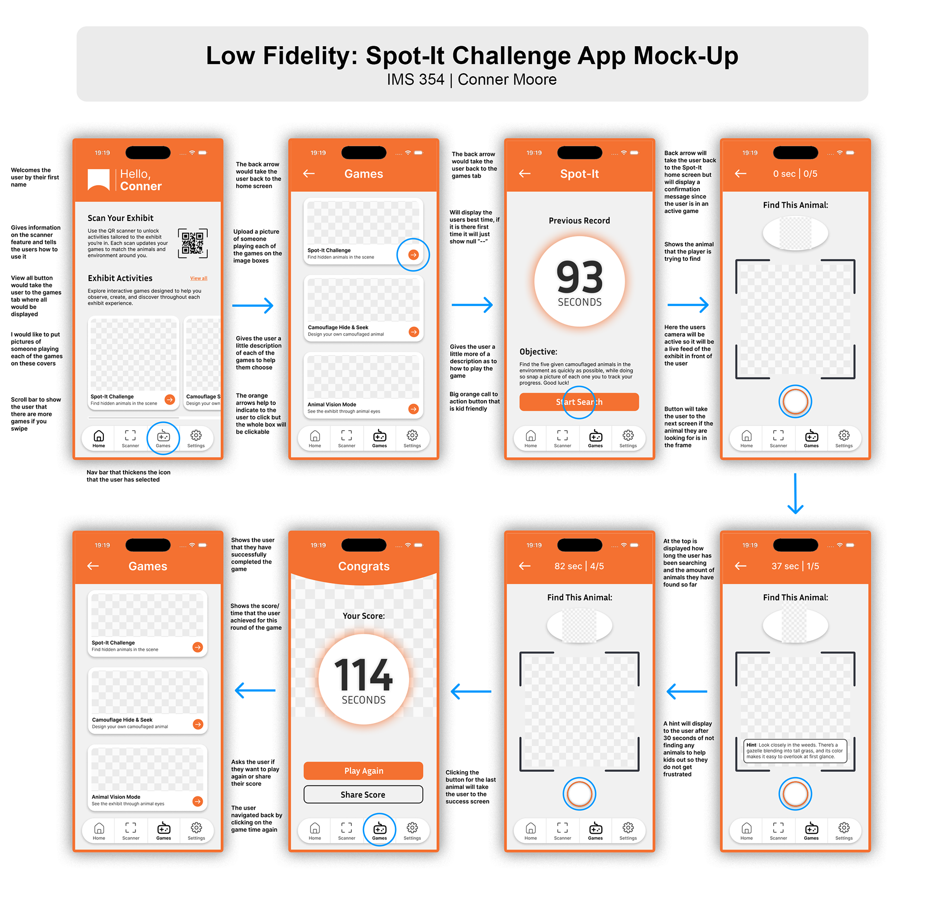
With the visual direction established, I moved into sketching before opening any design software. I sketched out the layout of the website pages, the app screens, and how I imagined the two interacting with the physical exhibit space. Starting on paper was a deliberate choice — it is a lot easier to throw out a sketch and try a new direction than it is to redo a Figma file, and at that early stage I had a lot of ideas I needed to work through quickly. Sketching let me get everything out of my head and onto paper without getting precious about any of it.
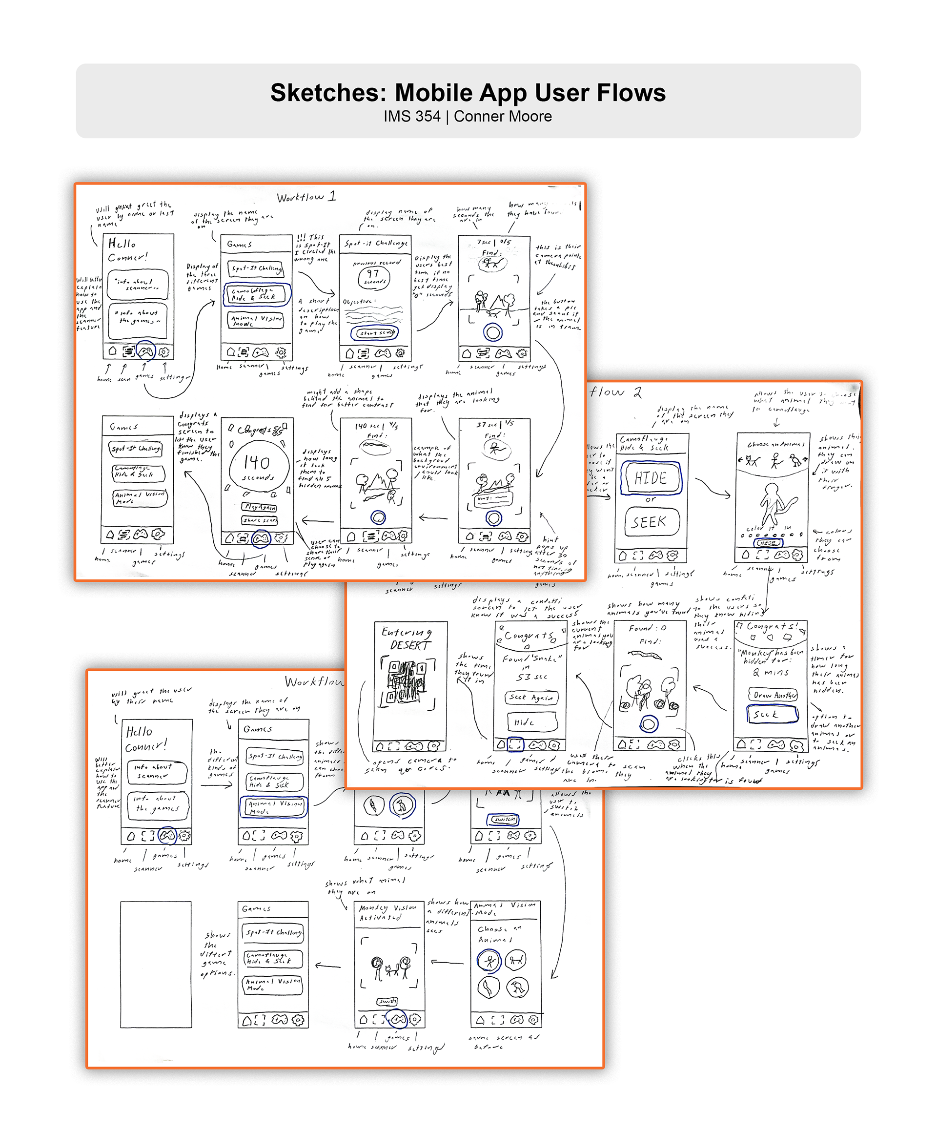
Once I had a layout direction I felt confident in, I moved into Figma to build proper wireframes based on those sketches. I tried to stay true to the structure I had worked out by hand while refining the proportions and thinking more carefully about how a user would actually navigate through each screen. After the wireframes were in a solid place, I shared them with peers to get feedback on the layouts, navigation flow, and overall clarity. The notes I got back were genuinely useful — people flagged things around spacing, screen hierarchy, and how intuitively you could move between sections of the app. I took that feedback seriously and made adjustments before moving into high-fidelity design. That back and forth made the final work noticeably stronger than if I had just pushed straight through on my own instincts.
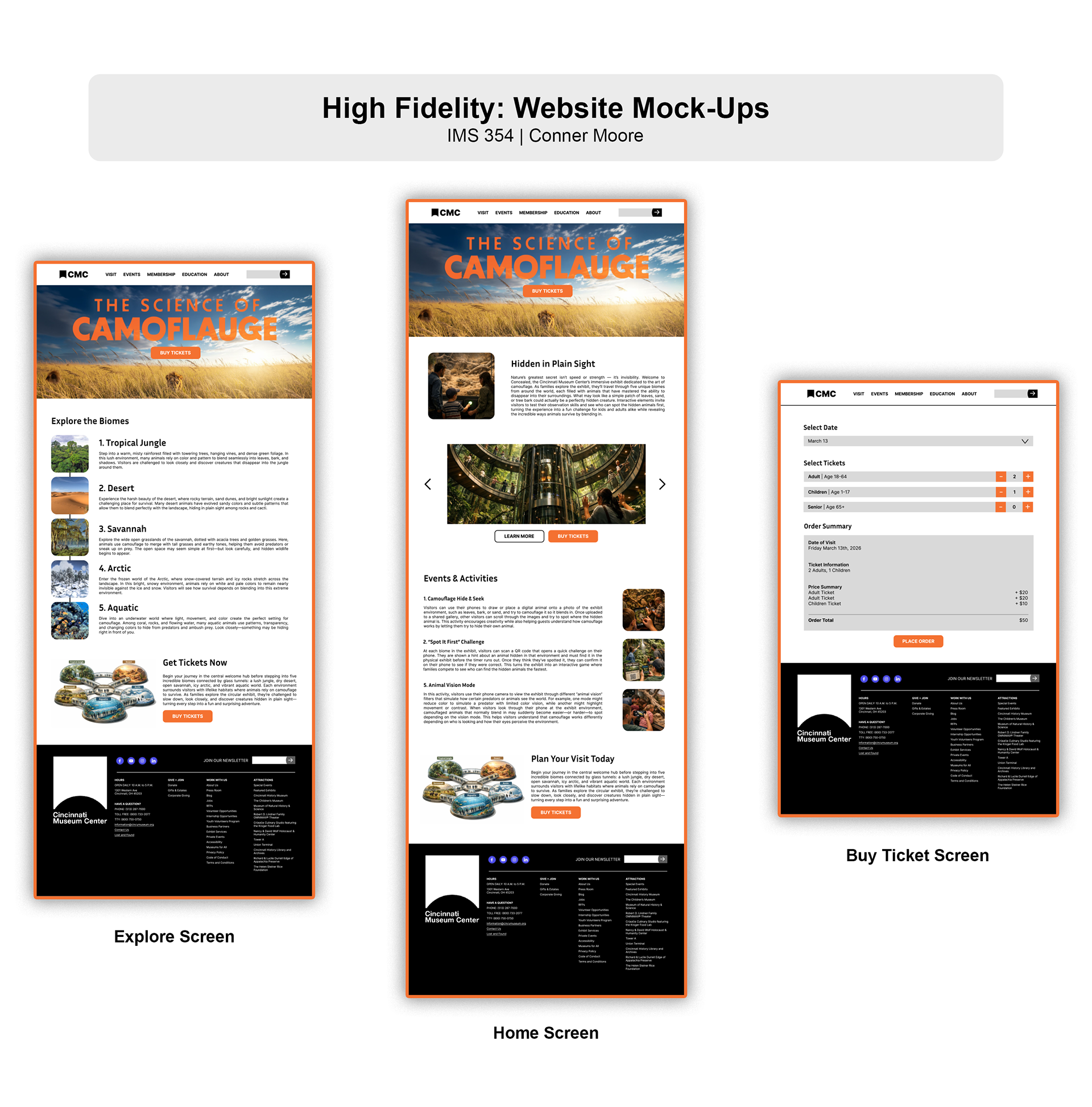
Website Design
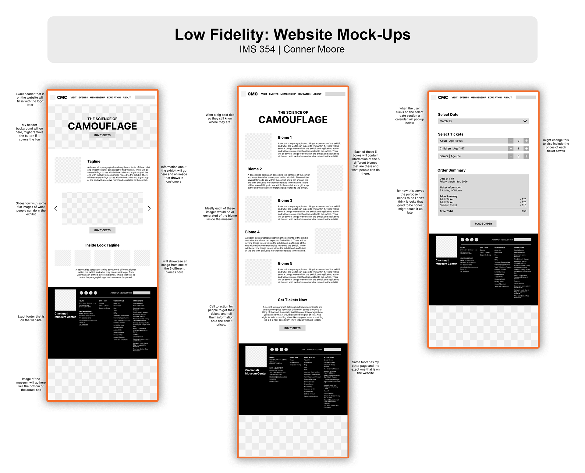
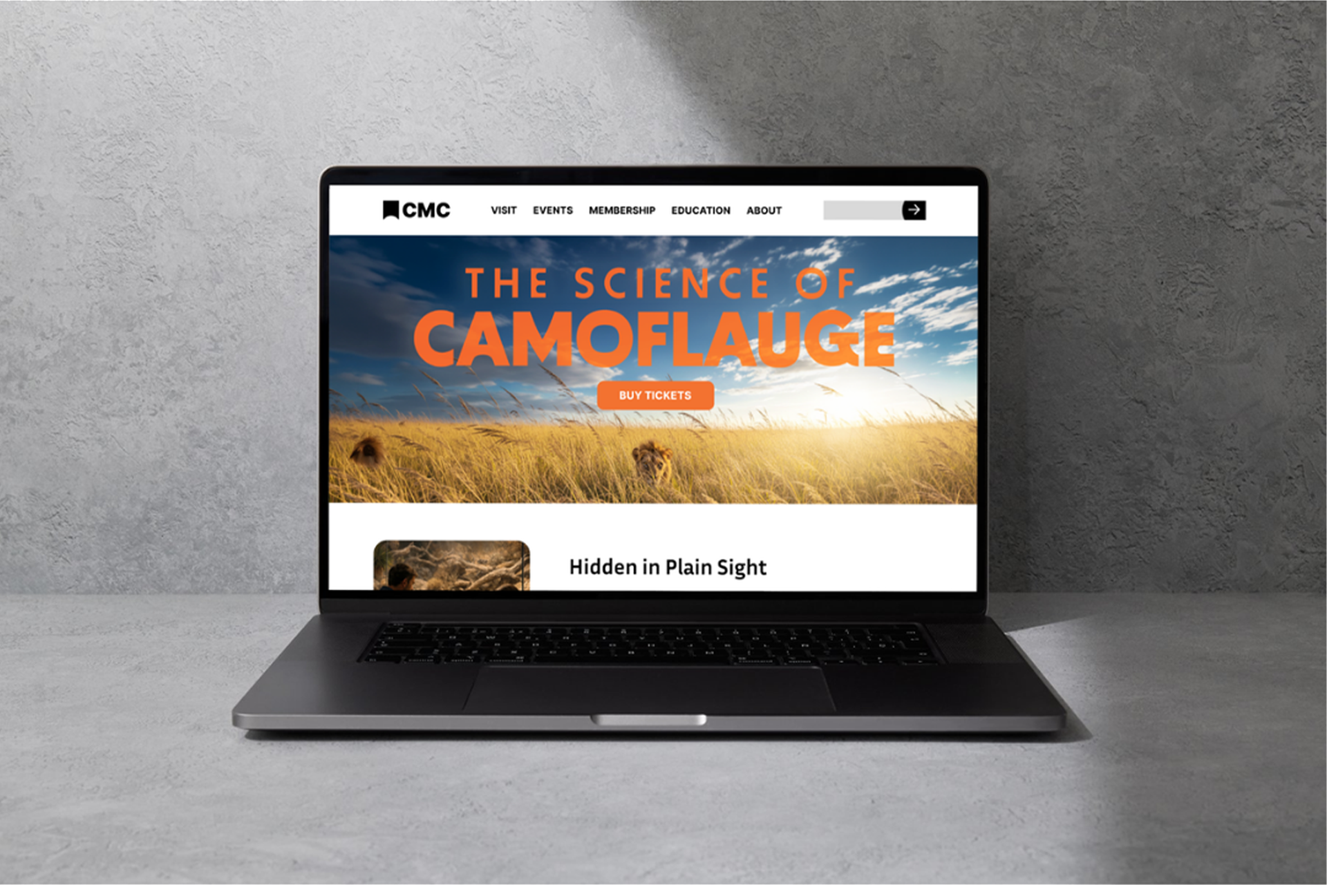
For the website I designed three pages that were meant to feel like a natural extension of the Cincinnati Museum Center's existing site. I matched their current header and footer structure on purpose — the goal was for someone visiting the real CMC site to land on my exhibit pages and feel like it belonged there, not like a student project stapled onto the side. That kind of attention to context is something I care about in my design work.
The visual content across the site was generated using AI image generation tools, where I wrote detailed prompts to produce the specific kind of animal and environment photography I needed. Getting those prompts right took more effort than I expected, but it meant I had imagery that actually matched the aesthetic I had built in the moodboard phase rather than settling for stock photos that were close but not quite right. Across all three pages I kept the design system consistent — the same button styles, the same image treatment, the same grid and type hierarchy — because consistency is what makes a multi-page site feel intentional and professional rather than pieced together.
Interactive App Design
The app is where I got to be the most creative with this project and it is honestly the part I am most proud of. The concept was to design a mobile experience that did not just supplement the exhibit — it was part of the exhibit. Without the app, you would miss things. That was the whole idea.
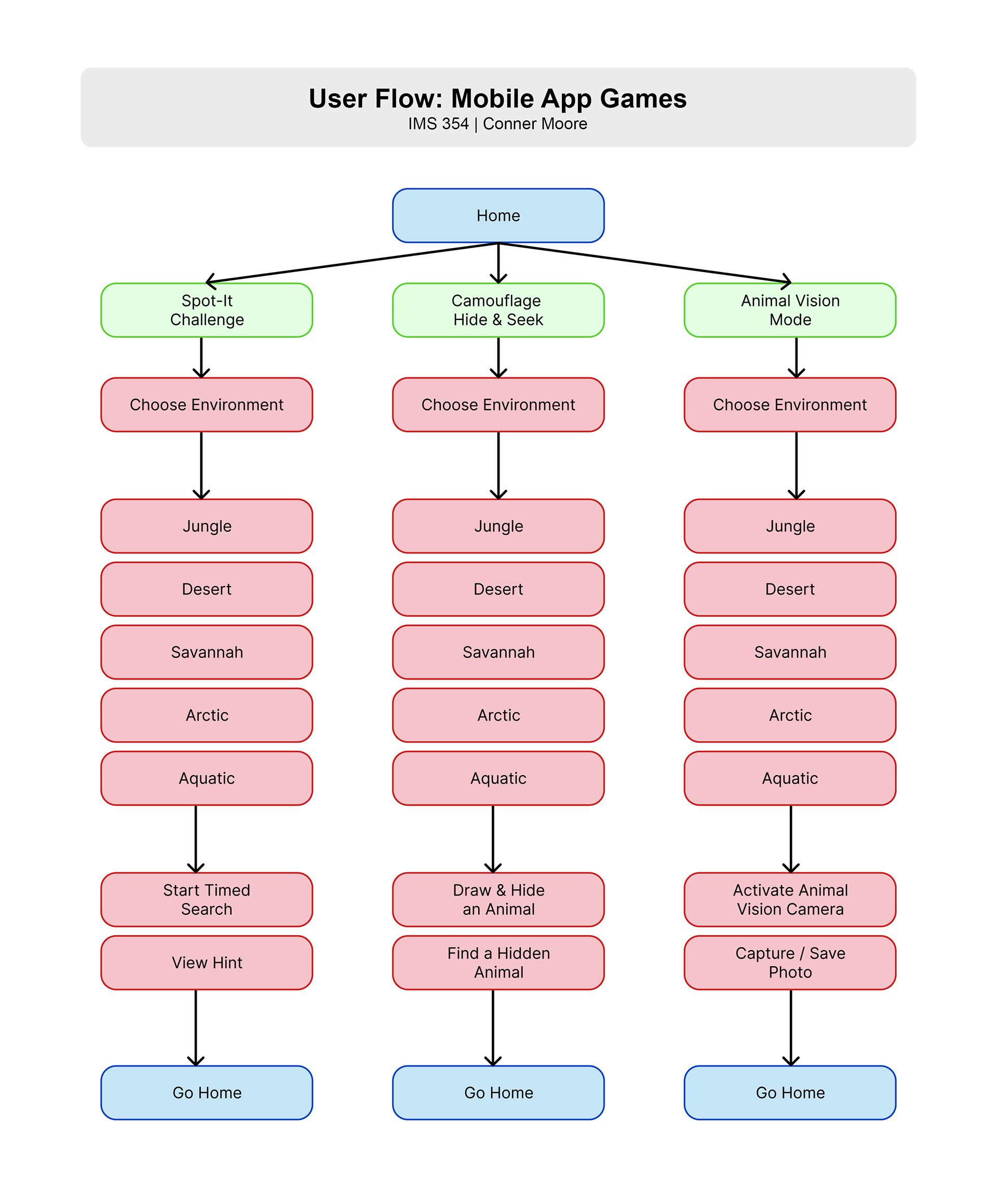
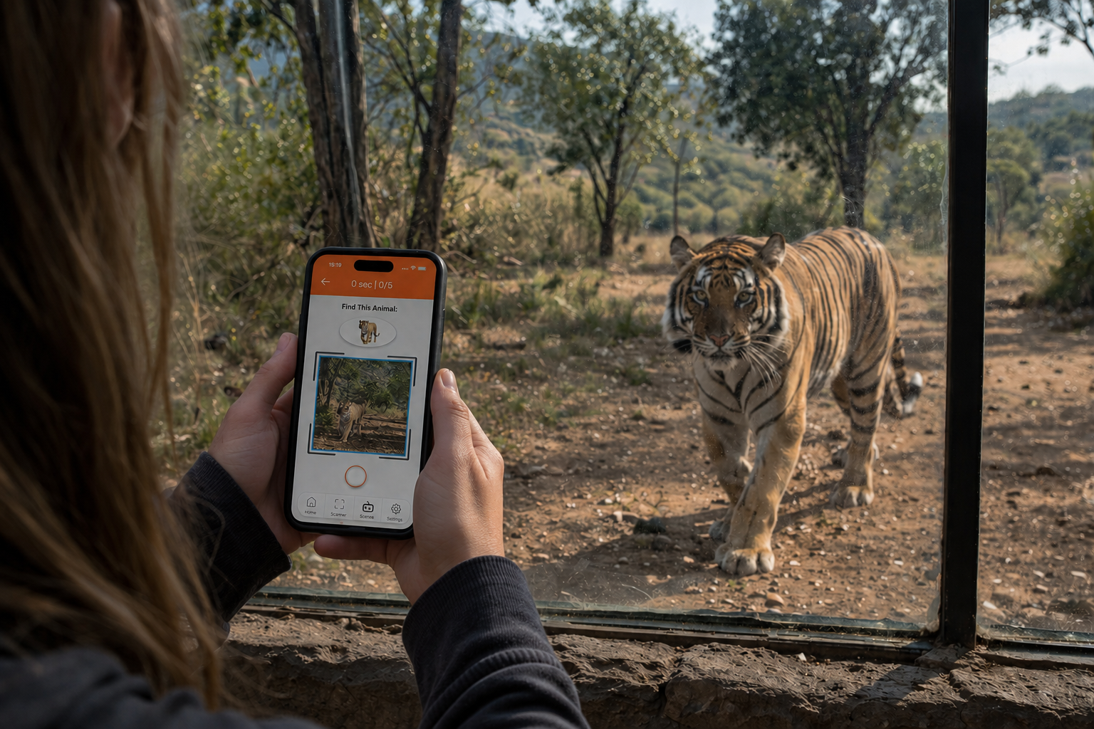
The app was designed to work hand in hand with the physical space around it. Rather than existing as a standalone experience on a screen, every feature was built around the idea that the visitor is standing inside the exhibit while using it. The vision I had was that a visitor could scan a QR code at the entrance of each biome to unlock that environment's specific activities, updating the animals, clues, and visuals to match exactly where they are standing. The physical exhibit and the app were always meant to feel like one thing, not two.
The three games I designed each approach camouflage from a different angle. Spot-It Challenge is a speed-based hunt where visitors race to find a camouflaged animal hidden in the biome, with optional hints available to keep it accessible for all ages. Camouflage Hide and Seek flips it around — visitors create and place their own camouflaged animal somewhere in the exhibit for others to find, adding a fun collaborative layer to the experience. Animal Vision Mode simulates how different animals perceive the world through ultraviolet and infrared, revealing hidden creatures in the exhibit that are invisible to the naked eye. All three games are fast to learn and designed so a kid can pick them up within thirty seconds, while still being engaging enough for adults.
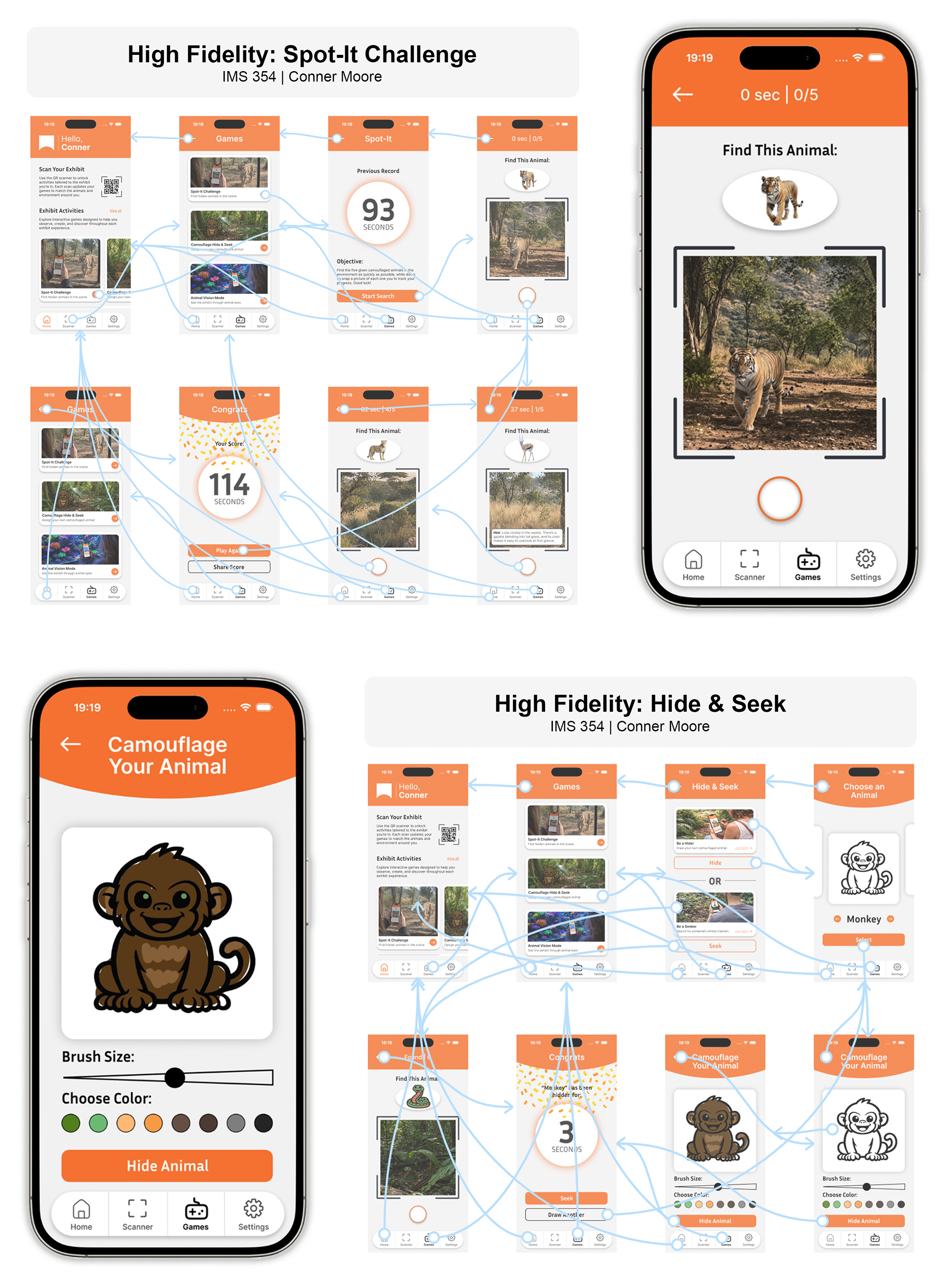
The centerpiece tying all of it together is the live camera feature, which runs through every game and is the idea I am most proud of creatively.
The way it works is that instead of confirming an answer by tapping a button, visitors use their phone camera to physically interact with the exhibit space around them. In Spot-It Challenge you take a photo of the animal you think you found, and an AI checks whether it is actually in the frame. If it is not there, you are not moving on — you have to keep looking. It removes any shortcut and forces genuine engagement with what is in front of you. Camouflage Hide and Seek uses the same idea but in reverse, with the camera being used to place and confirm a hidden animal in the space. And in Animal Vision Mode the camera completely transforms the way you see the exhibit — switching into UV or infrared to reveal animals hidden in the environment that you simply cannot see with your own eyes.
I think what makes this feature meaningful beyond just being a cool idea is that it connects back to what the exhibit is actually about. Camouflage is all about training yourself to see differently, and that is exactly what the camera is asking visitors to do.
Wayfinding and Signage
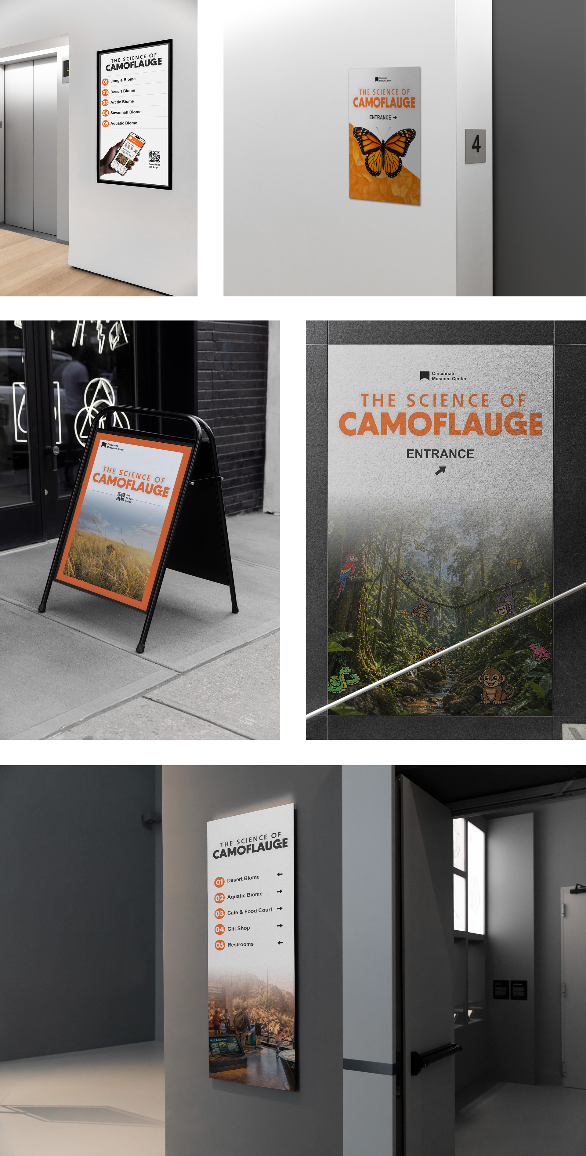
To complete the full exhibit concept, I designed physical signage and wayfinding materials that would guide visitors through the space — entry graphics, directional signs, and interpretive panels, all carrying the same visual language built throughout the rest of the project. Keeping the design consistent from the digital screens all the way down to the physical signs was a priority for me because that is what makes an exhibit feel like a real, considered experience rather than a collection of separate pieces.
To show the designs in context, I mocked the signage up on actual building environments so you could see what it would genuinely look like to approach the exhibit from outside and navigate through it once inside. That step of placing the work in the real world was important to me — it is one thing to design a sign in isolation, and another to see it at scale on a building and know whether it actually works.
What I Learned
Choosing camouflage as my topic was a bit of a leap — it was not an obvious choice and there was no existing template to follow. But taking that creative risk is something I am really glad I did, because it pushed me to come up with original solutions at every stage rather than leaning on what had already been done.
One of the biggest things I took away from this project was how much the early work matters. The moodboarding, the sketching, the wireframing — none of it feels glamorous but all of it directly shaped how strong the final work turned out. Every time I was tempted to skip ahead, slowing down and doing the process right paid off. The feedback I got on my wireframes is a good example of that. Those conversations caught things I had stopped noticing because I had been staring at the screens too long, and the adjustments I made because of them genuinely improved the final design.
I also learned a lot about what it means to design across multiple touchpoints. Keeping the website, the app, and the physical signage feeling like one cohesive experience required constant cross-referencing and a lot of intentional decision making. It is easy for things to drift when you are working across that many deliverables, and staying consistent took more discipline than I expected.
The app design specifically taught me how to think about interactivity in a way that goes beyond the screen. Coming up with the live camera mechanic pushed me to think about what the user is actually doing with their body, not just their thumb, and I think that is a perspective I will carry into every project I work on going forward. Designing something that only works when you are fully present in a physical space was a different kind of challenge and one I really enjoyed figuring out.
Overall this project made me more confident in my ability to take an original idea and see it all the way through. I came in with a concept nobody had asked me to do and left with a full exhibit experience I am genuinely proud of.