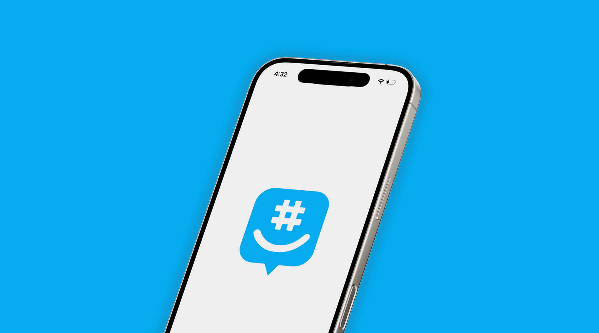
GroupMe
Overview
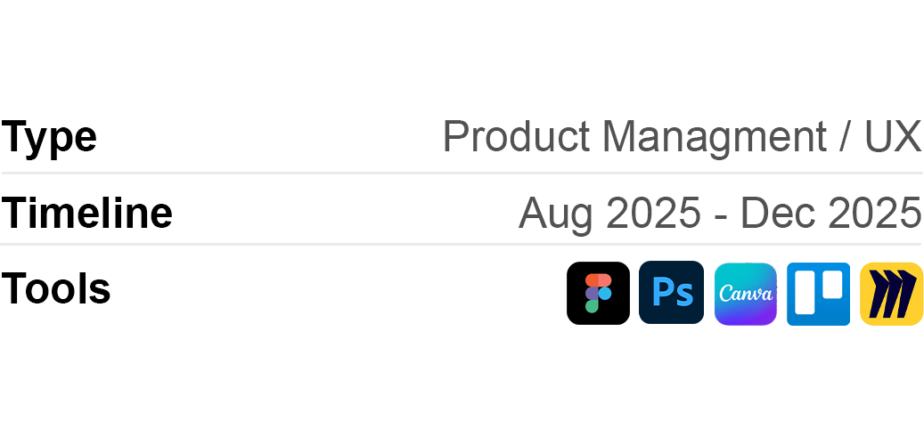
This was a semester-long product management project where I took on the role of Senior Product Manager for GroupMe — a Microsoft-owned group messaging app widely used by students and small communities. The goal was to analyze the product end to end, identify where it was falling short, and design strategic improvements backed by research. The final deliverable was a full executive-level product strategy presented to a live audience, covering market analysis, user research, competitive positioning, and four fully designed feature proposals.
The Problem
GroupMe has a strong foothold in the student market, but the product hasn't kept pace with user expectations. Onboarding creates unnecessary friction, the Discover section is outdated and hard to navigate, and several features go unnoticed because the app's layout doesn't surface them well. In a market projected to reach $64.39 billion by 2033, GroupMe risks losing relevance if it doesn't evolve. The central question driving this project: how do you modernize a product without losing what made it useful in the first place?
My Role
• Conducted customer, market, and competitor analysis to establish strategic context
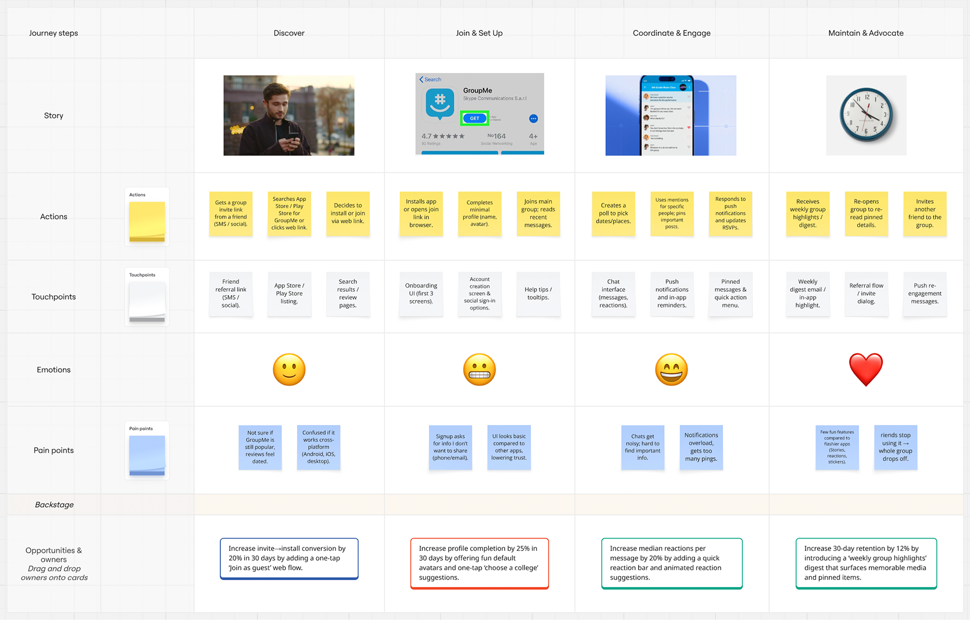
• Mapped the full consumer journey across four stages — from discovery to long-term retention
• Audited the existing product through user flow analysis and site mapping
• Proposed and designed four new features with supporting flow charts and high-fidelity mockups
• Designed an A/B test to validate onboarding improvements
• Built a Business Model Canvas and outlined go-to-market strategy
• Skills: Product strategy, UX research, user flow mapping, wireframing, prototyping, competitive analysis, A/B testing
Research & Analysis
Market Sizing The global messaging market sits at $28.92 billion in 2024, projected to hit $64.39 billion by 2033 at a 9.3% CAGR. GroupMe's core target — approximately 20 million university students across the U.S. and Europe — represents a highly engaged, underserved segment of that market.
Competitive Landscape I mapped GroupMe against six competitors including WhatsApp, Discord, Telegram, Slack, and Microsoft Teams. Most competitors either skew too complex for casual users or lack genuine community-discovery tools. GroupMe's simplicity is its strength — but without better discovery and engagement features, it risks being replaced by apps that offer more without adding noise.
Consumer Journey Map Mapping the full user journey revealed friction at every stage — a lengthy sign-up flow, notification overload during active use, and group drop-off over time. Each pain point shaped the feature proposals that followed.
Product Analysis
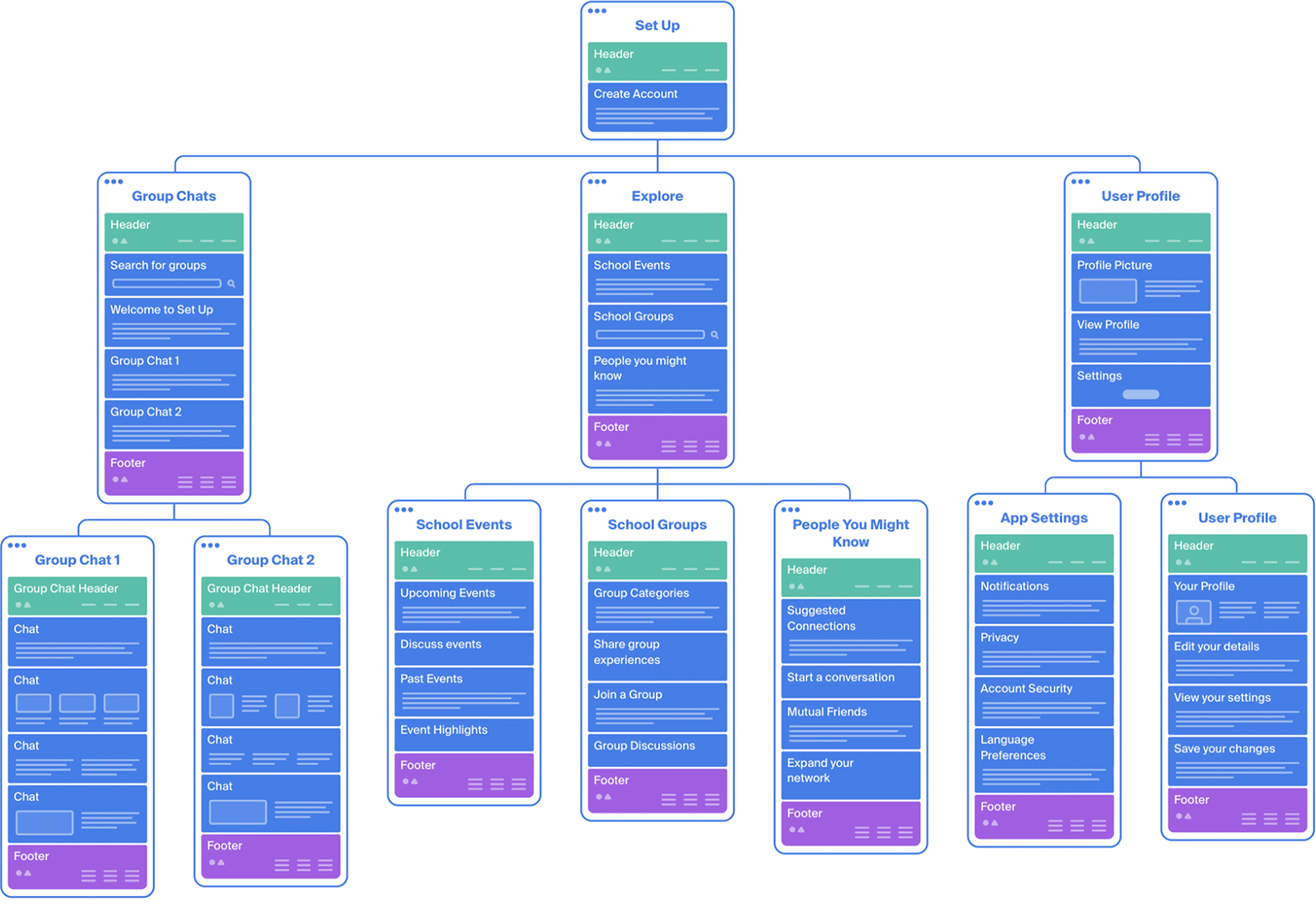
User Flow & Site Map I mapped GroupMe's complete user flow and built a full site map of the app's architecture. The audit revealed that onboarding alone involved 21 steps before a user ever sent a message. The site map also made clear that Discover — the app's most differentiating feature — was buried and not reflected as a product priority.
Feature Design
Based on the audit and journey mapping, I proposed four features. Each includes a written rationale, a detailed user flow chart, and a high-fidelity mockup.
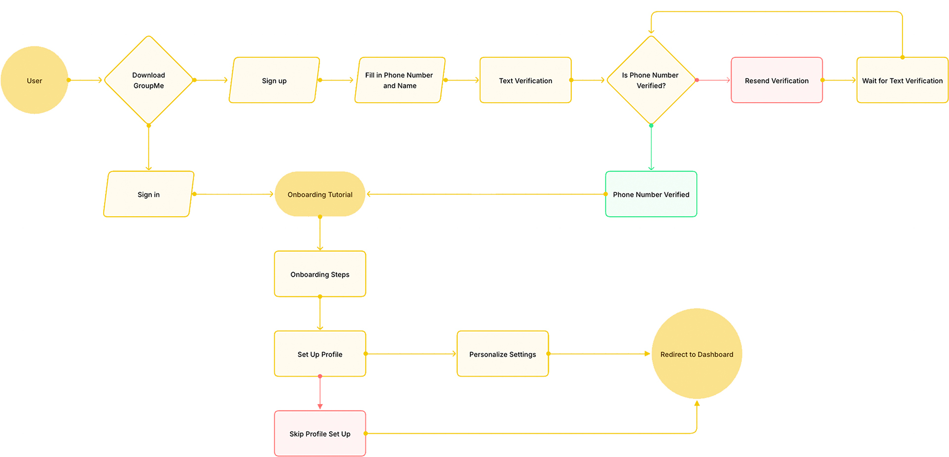
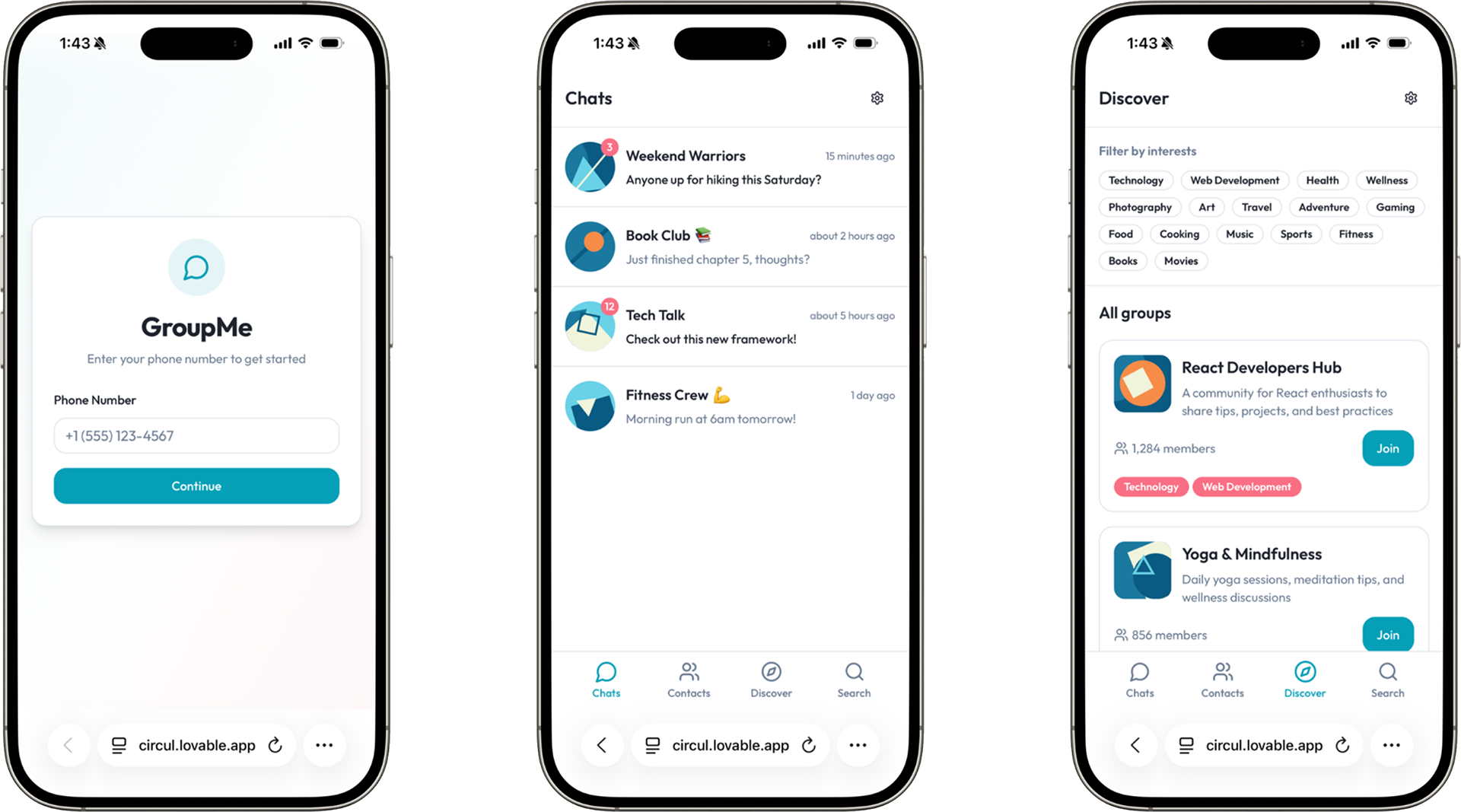
1. Quick Start — Streamlined Onboarding Reduced the sign-up flow to a single phone number entry, deferring optional profile steps until after first use. Validated through A/B testing, the redesign improved signup completion rates and Time-to-First-Message — a key early retention metric.
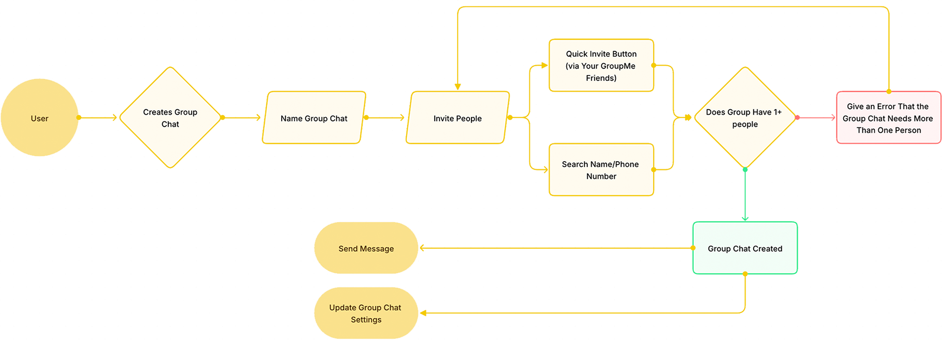
2. Easy Chat Create — Simplified Group Creation Streamlined group creation to three steps: name the group, invite contacts, and start messaging. Clear error handling prevents dead ends when users attempt to create a group without enough members.
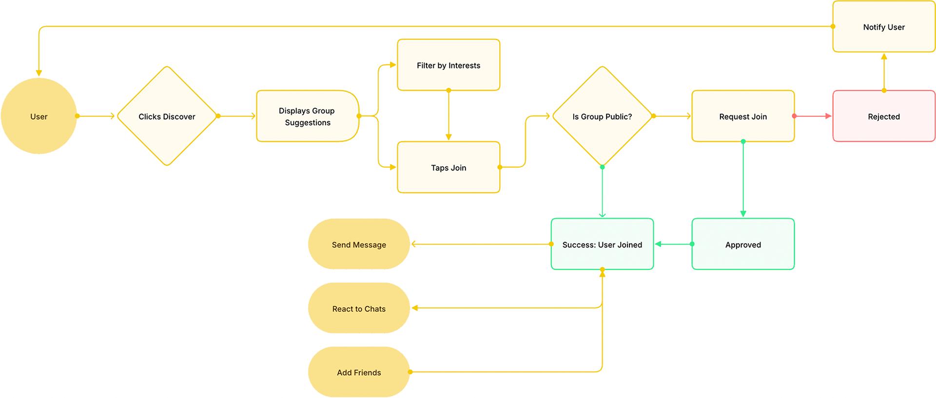
3. Better Group Discovery — Redesigned Discover Section Transformed Discover into a filterable, interest-driven hub where users can browse and join groups with a single tap. Supports both public instant-join and private request-and-approval flows.
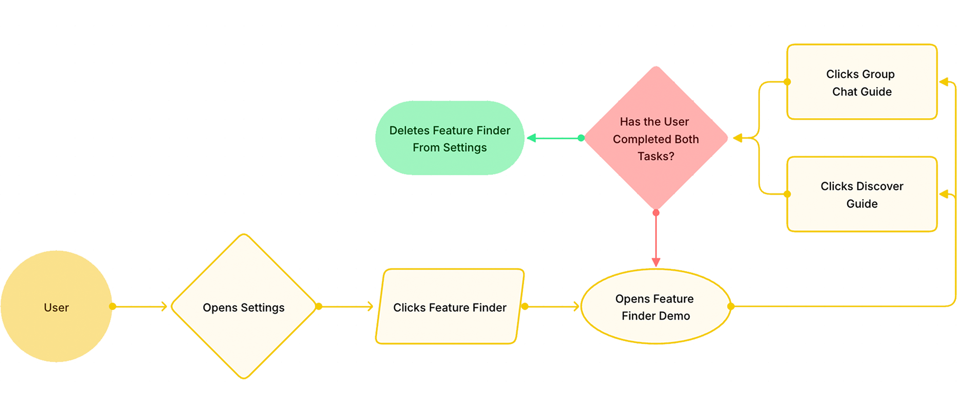
4. Feature Finder — In-App Guided Discovery An opt-in walkthrough that introduces users to two underused features — Group Chat tools and Discover. Once both tasks are completed, Feature Finder removes itself from settings, keeping the interface clean.
Final Product
The final deliverable was a fully redesigned GroupMe experience built around the four proposed features. The mockups reflect a cohesive, modernized version of the app — addressing the friction points uncovered in research while staying true to GroupMe's core simplicity.
The redesign included a dark-mode interface with cleaner navigation, a streamlined onboarding flow that gets users to their first message in seconds, a simplified chat creation experience, a rebuilt Discover section with interest-based filtering and one-tap group joining, and a Feature Finder that guides users to the tools they'd otherwise miss.
Together, these screens represent what GroupMe could look like if the product prioritized user clarity and community discovery as much as it does messaging.
Key Takeaways
This project taught me how to think like a PM — not just a designer. Good product decisions require understanding the market, the user, and the business at the same time. It also reinforced something I now apply to every project: the most valuable improvements aren't always additions. Sometimes the best move is removing friction and helping users find what's already there.